Wednesday, 14 April 2010

20. “I am leaf on the wind. Watch how I soar.” /Wash/


This is picture taken by me by Baltic sea in Latvia, Mazirbe.

The composition of this image makes impression of soaring. Because the wind is blowing and the girl is gliding hand lightly in the air.

Most of sunny photos by the sea with wind blowing in hair creates the that sensation of freedom an lightness. I hope so does this.

And more important is that the horizon is slanting so looking at this picture there is no thought about standing solidly with both feet in sand.

And to top it of the sea shells kind of make a road ahead. And it does not end so she can go on and on.

19. Movie posters – Lord of the Rings.


I never noticed before but these three posters can be analyzed by the size and place of the characters.

In “The Fellowship of the ring” poster the dominating (front and largest) is Frodo since in this movie it is all about him. Next are Gandalf and Aragorn standing behind the hobbit as guardians; and further on the rest of the fellowship. Arwen is beside Aragorn because of their relationship but Galadriel is above them all – dressed in white as the symbol of good and pure. The opposite to her are the Nazguls – beneath them as a black, scary cloud.

“The Two Towers” poster is different with the fact that actually the dominating image is of the Sauron tower. Because in the second movie the Bad side start to show its power. But none of the characters are actually dominant because in “The Two Towers” several stories are told parallel each other and all of them are important. In this poster is also Eowyn who is standing between Aragon and Arwen symbolizing that she in a way messes with their relationship.

The dominant character in “The Return of the King” movie and poster is Aragon. But Frodo is still in front and the rest are “guarding his back” as it is in the movie as well. Even Gollum is on this poster in front because he has important role to play in events of third movie. But behind them in the distance is Sauron – always looming and being constant reminder of the danger.

18. “Keep your coins, I want change” by Banksy.


The British “art terrorist” Banksy has created this underground masterpiece and other unique graffiti artwork. He has approached different problems and this graffiti is one of the best known.

I see this as a good way to show discontent and frustration about nowadays problems. The young man has been sprayed only in black and white but you can distinctly see how he looks. Mostly dominates red colour that as i said before is colour of revolution and passion. But the text is what catches attention the most because it is witty – at first it could be confusing because of word “change” ambiguous meaning.

Most say that this graffiti is inspiring.

17. „Dogs playing poker” by Cash Coolidge (1903) modernized version.


The original was commissioned by Brown&Bigelow to advertise cigars and this one was most printed from the series.

In the ‘modern’ version few of the dogs have been replaced by well known dogs from cartoons that in their shows are more or less anthropomorphized the same as C. Coolidge had anthropomorphized his painted dogs.

I think the replacements have been made carefully and every cartoon character mach the original. In the original the most intimidating is the Dog who is replaced with Stich (who is not even a dog and can destroy everything in his path) but both of them usually are gentle. Then Scooby – the funniest and mischievous cartoon has replaced a dog that seems to be planning something impish. And both Pluto and the original dog have something enjoyable in their mouths and they do not look stressed about the game. And I guess Oddie is not allowed at the table because he is quite stupid.

I think this idea of adding cartoons to popular work of arts is really interesting and I hope it will continue to develope.

16. The Summer Sunrise.


This is picture of sunrise behind my house in summer of 2009 made by me.

I chose this photo because of the contrasting colours – bright orange and dark green and greyish blue. And also because of perspective grass looks nearly taller than forest on horizon.

The rising sun casts rays in a way that they reflect on the lens and it looks like you almost can see them.

Beautiful.

Tuesday, 13 April 2010

15. Soviet Union propaganda. ’All hail the young pioneers – worthy next generation of Lenin-Stalinist Komsomol’


This is propaganda poster used in Latvia in late 1940’s or early 1950’s and was commissioned by Communist Party for displaying to society of Soviet Union, especially children, to recruit new pioneers and more importantly to influence their opinions of the Pioneers.

The poster is classical piece of soviet propaganda – Socialist realism, little text, symbols, usage of colours, and ideology. In soviet propaganda posters it was common to have little text so they were also effective in reaching the uneducated or in this case those who have not yet learned to read. Children in the poster are both genders and wearing different uniforms which indicates that pioneers are different and encourages different children to join – both sexes, various interests. All three pioneers are smiling and looking forward in same direction. Smiles symbolize being happy and proud of being a pioneer but fixed looks could have two meanings – they are eagerly looking forward to future, to communist World revolution thy hope to be part of or it is reference to the text that pioneers are anticipating being the ‘worthy next generation of Komsomol’. It also could be both meanings. The kerchief was three cornered with corners symbolizing the Communist Party, the Komsomol and the Pioneers.

It is no coincidence that Stalin is portrayed beside Lenin because it was commonly used emblem which indicates that Stalin is rightful successor of Lenin. The colour of the flag also is no contingency. Red colour was general symbol of communism (symbol of revolution) as was the star and sickle and hammer nonetheless it is uncommon that the said symbol is absent from this poster and that the red star appears only on the hat of one of pioneers. All these connotations combined makes clear message – being part of the Pioneers means being part of something bigger and it feels good, pioneers are proud of what they.

14. Butterfly.


This is another drawing of mine only this one is in ink. This is the third way I sometimes draw – patterns without sense. They are mostly just swirls and lines but in the end they take some form.

As this one – I did not know what I was doing until in the end I understood that it is a stylized butterfly (it looks like I really have a thing for butterflies :D ).

It is circle composition with some bold, some light lines, circles are together with checks and swirls. Everything put together absent-mindedly with quite enjoyable outcome.

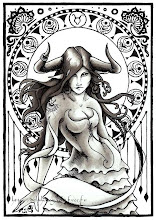
13. Taurus.


This drawing of Zodiac sign Taurus is really expressive and truthful.

So what makes her a Taurus?

Of course, the obvious things – the horns and Taurus sign on top of the circle behind her and she also has a tattoo on right arm in form of ox head. But then there are the small details that complete the character.

Firstly, there are quite few details in form of ox horns – the top of the dress and ornaments in the circle. Secondly, her pose and facial expression. She is standing in challenging, stubborn, determined and confident way and her expression is the same; and Taurus is all of these things.

12. CD cover for Brainstorm album Four Shores (Latvian edition; 2005).


The author is Anton Corbjin. This album was very emotional for the most popular Latvian band and he has put a lot thought in creating this cover.

Originally there were five guys in the band who were together since high school. But a year before the release of Four Shores the bass guitarist died and the album they started together the rest four guys had to finish by themselves.

That is the reason why it is called “Four Shores” and also why there is four cups not standing right. The cups symbolizes the guys from Brainstorm who were still standing but nor entirely the way it is supposed to. But they were holding on.

11. Save earth series postcard.


I found this postcard amusing because it is different than others ‘save Earth’ or ‘go green’ postcards.

It is simple and realistic but I think that the text is quite powerful. It is meant to tell people that we are all the same in this situation and that everybody has to help. But at the same time it makes reference to many movies about how we can fly away from Earth when we eventually destroy it. And maybe it also meant to be as a wake-up call o those sci-fi fans who believe in that option and to remind that Earth is all we have – there will not be another chance.

10. Under the Heel.


This is really feministic and funny wallpaper. It shows in very visual way that a woman can rule over a man.

Her shoes are elegant and sexy showing off the power of a woman even more. Important is the fact that the shoe “holding down” the man is red because it is colour of passion and revolution and that is very appropriate for this image because it demonstrates that the woman is the passionate and determined one to make this kind of revolutionary idea work.

The man is bowing his head in defeat and the fact that he is only in his underwear only adds to his embarrassment.

9. Picture 226.


This picture was taken on 23rd of August 2009with my photo camera on the next day after a house party at my house. I do not think that somebody was trying to capture anything in particular but the outcome is interesting.

What I find peculiar and fascinating is the drastic difference between the blooming, beautiful and colourful plant in the centre and the mess around and tired faces behind it. It doesn’t really make sense that the central and one of the most colourful objects is actually the last thing everybody notices if notices at all. Of course, the bottles are in front but still they are not the centre.

Maybe it is because the girls behind the plant, the red shisha and kind of the cans and bottles also are under influence the rule of thirds so that is what one would see first.

Monday, 12 April 2010

8. Letters and words.


These also are my works. Some time ago I had infatuation with drawing words and I sometimes do it still. But in this case also unfortunately I could not find my better works so I had to manage with what I had.

Actually the only one worth noticing is the top ‘Photograph’ – dark, hard outlines and a bit colour inside. And I also like the red exclamation mark beneath. :)

The word to I draw just seems the strongest and more present in my thoughts at the time – that is how I choose what to draw. And depending on how the word feels and sounds to me with that kind of letters I draw – bold, round, shaggy or other.

7. The gray pencil.


These are my drawings. I am not talented but I enjoy drawing simple things with gray pencil when I have time and when I am in a mood for it.

I especially like to concentrate on details, drawing small or real things. These are not my best works but unfortunately most of them are either lost or I have thrown the out. They are nothing special but I like to play with shadows and merging lines.

And it is really easy to determine when I have made these, if one knows me a bit. The largest one that contains flower, butterfly, an R and stylized 18 was made around 22nd of April 2008 – it is definitely spring because then I get carried away drawing that kind of flowers and butterflies, R is for my surname and it goes with 18 which means I had turned 18 recently. It is the same with the other butterfly – made in spring. The ring is token ring from my school so I probably drew it after I got it.

6. The cover of S. Meyer’s book Breaking Dawn.


I have always liked book covers with deeper meaning and all books of Twilight saga have interesting and thought out names and covers. But Breaking Dawn has been the most confusing for most.

As it turns out the pawn and the queen symbolizes the main character Bella and her journey through the books. She started as the weakest – the pawn – but in the end Bella was the strongest of all – the queen. I guess then the chess board can be seen as life (especially if you see life as kind of a game). And I suspect that the choice of colours (black, white and red) was just continuing tradition and to help fans recognize the book since all previous three were also in the same colours.

5. “La Toilette” by Henri de Toulouse-Lautrec.


Usually works of de Toulouse-Lautrec were ironic and grotesque but that it is not that pronounced in “La Toilette”. I think that the model is one of courtesans on Montmartre. The angle in this painting is unusual and even though it cannot be seen de Toulouse-Lautrec has portrayed a movement because it you actually cannot see what the girl is doing. “La Toilette” has central composition but in the background is explicitly fragmentary. There are vast, decorative spots of colour and the light polychromie mostly in blue tones.

Even though Henri de Toulouse-Lautrec was post-impressionist in “La Toilette” are some signs of art nouveau, for example, dynamics of the lines of the clothes and the little table in the background.

To me the painting seems to radiate feeling of fatality and despair but also strength and will to fight.

Now the painting is at Musée du Louvre in Paris.

Friday, 9 April 2010

4. Heineken Walk-In-Fridge


This is one of my favourite commercials. It is quite old now but people still like to watch it again and again. Since I’m interested in advertising I like to analyze the way an ad is supposed to influence the audience and if it is successful.


In this case the advertisers want to show women how good Heineken beer is by comparing it to walk-in closet (which is every woman’s dream) and in the same time attract the attention of men with the same comparison which is ironical in a way. The ultimate goal is to make the audience believe that full fridge with Heineken is better than new house with a walk-in closet. And the advertisers do it gracefully with a nice dose of humour.


I have heard comments about this commercial that finally we know what can bring men to tears, tears of joy. :)

3. Ecoki logo


Ecoki – eco-lifestyle community – has created interesting logo that is based on a witty name. Its origin is from Latvia and word ‘koki’ means trees so by adding it together with ‘eco’ they have created appropriate name for eco-lifestyle community – Ecotrees, only mashed-up in one word.

Ecoki logo is perfect for this kind of lifestyle; the earthy tones, eco-ish looking background, of course, a tree (since they are ecotrees) that has been turned to a world in addition. Making us think about forests as lungs of Earth.

2. City in the grasp.


I found this picture accidentally but I think it is very interesting. It was under category “Not Photoshopped” and, if you look closely, the way the photo is taken is quite simple – the glass sphere reflects the nice view from roof (or balcony or whatever) upside-down and the picture is turned by 180 degrees.

But the idea is really creative and the outcome is beautiful. And who would not want to hold the city in your grasp?

And one can also make a suggestion that this photo has deeper meaning – maybe someone does “hold the city in a fist”.

1. St. John in the Wilderness by Leonardo da Vinci (1510-1515)


Everyone agrees that Leonardo da Vinci was a genius but many also say that he was a rebel, that he was not real Christian and follower of the Church. The artist loved to use symbols and allegories and he did it so masterfully that most had no clue of the real meaning of a painting at the time.

St. John in the Wilderness is another example of this. Even though the name of the work claims that the man in painting is the Baptist but several things show that he actually is the classical god of vine Bacchus.

The man is crowned with a laurel wreath, wearing a fur garment, carrying a staff and holding a bunch of grapes. The fur and the staff is attributes of St. John but the laurel wreath and grapes have no connection to him and also is not symbols of Christianity. Also the staff is without a cross as it usually is in interpretations of the Baptist. The way the fur garment is wrapped around the man and the surroundings are usually features of a mythical painting. In the background is another symbol that does not fit into religious work of art – the deer. It may be only a background but a deer is pagan symbol of gentleness and also a deer was often portrayed as a companion of classical gods. Another thing that might be or might not be true is that the man is pointing with his left hand to a spring holding the grapes in the same hand as to maybe hint us that together it would make vine.

In St. John in the Wilderness very noticeable is the perspective – the mountains in the background. By using lighter colours in the background and darker in front (the centre figure and the birch a bit further) da Vinci has created depth in his work.

Now the painting is at Musée du Louvre in Paris.